.jpeg)
 No.
No.
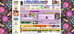
With 3 seconds to impress - or at least not scare away - prospective clients with your financial or insurance website, your layout has a lot of say as to which occurs. Take these five tips into consideration when tinkering with your website.
White space
White space is anything but wasted space. In 1930, Jan Tschichold, once a leading advocate of modern design said, "white space is to be regarded as an active element, not a passive background." Little did he know that 74 years later someone would conduct a study that proved just how active it is. In 2004, D.Y. M. Lin concluded that white space can increase comprehension by almost 20%.
If the layout on your website doesn't make good use of white space, your readers will have a harder time focusing on what's important.
F is for eFFective
In terms of how you put your written content into your white space, it should loosely follow an F-shaped pattern. Back in 2010, the Nielsen Norman Group performed an eye-tracking study to watch how users interacted visually with websites. What they found was that eye movements generally tracked in the shape on an F. Readers make two horizontal eye movements from left to right, and then scan the content's left side downwards, creating that F.
What this means is that you should put what you deem to be the essential information about your advisory, brokerage, or you, in the first two lines or paragraphs. Also, make sure that your content is scannable - hardly any one reads word for word anymore.
To the left, to the left
The Nielsen Group also found that our eyes prefer the left in general, regardless of the type of content. They discovered that people spent twice as much time looking at the left, rather than right, side of a web page.
When organizing your financial or insurance website, keep your most important images to the left, like your logo and any calls-to-action.
Make Sense
While you're following these sciency tips, don't forget that your layout also needs to make logical sense, not just visual sense. It's all good and well if you have plenty of white space, your text in the shape of an F, and your most important 'click me's on the left, but if your 'About Me' is hiding on the third page, last on the list of a lengthy drop-down menu labelled 'Services,' you're going to frustrate your users.
And unfortunately, users will transfer those feelings of frustration with your website onto you and your firm. Good design may be invisible, but it's not unimportant.
Lay out every page like a landing page
Within reason, of course.
Landing pages are designed to make your web visitor take one specific action, whether it's download an ebook or book a meeting. Obviously your homepage has a few more jobs it needs to do, but the landing page takeaway is the 'less-is-more' approach. Don't overwhelm your prospective clients with too many things to do or they won't do any.