You’re a financial advisor, meaning that you know A LOT more about finance than I do. And we’re a group of web designers and we know A LOT more about web design than you do (sorry!). So it’s ok if you don’t know what every web design term means, I don’t know what a lot of financial terms mean (sorry mom).
But don’t worry, we’ve created a basic dictionary of some of the most used web design terms out there just for you.
1. 301 Redirect
A 301 redirect is a method for moving a web page to a new location. When would you use this? Let’s say that for the last five years your website domain name has been BestFinancialAdvisor.com, but now you want it to be UltimateFinancialAdvisor.com. You would use 301 redirect to tell web browsers that whenever someone types in BestFinancialAdvisor.com to instead take you to UltimateFinancialAdvisor.com.
2. Above the Fold
Above the fold is the section of a webpage that is immediately visible in a browser when it loads and doesn’t require scrolling. So make sure that any content you have above the fold of your website will leave a great first impression on the viewer.
3. ALT Attribute
Alt attributes describe the function of each image you have on your website. This helps Google determine what the image is and the topic of surrounding text. Hover your cursor over this image of the Advisor Websites logo to see an example of an alt text.

(make the alt text: hey there! This is an image of the Advisor Websites logo to show what an alt text is like, this will help with SEO).
4. Call to Action
A Call to Action (CTA) is used to ask viewers to perform a specific action. Text, images, banners, or buttons used in a persuasive tone are call-to-actions. For example, check out our latest ebook: The Financial Advisors’ Guide to Writing Biographies, Blogs, Ebooks, and Case Studies. (that was a call to action by the way! But seriously, go check that ebook out).
5. Cookies
A cookie is a very small file that’s stored on your computer from a specific website. Each time you visit that website, your browser sends codes to the website. Don’t worry cookies do not usually contain anything dangerous or personal information. Why would cookies be useful to you? The data from cookies can tell you who visited your website, how often they visit, what parts of the website they visit the most, and their preferences.
6. Colour Scheme
Colour scheme is the choice of colours you use throughout your webpage. You want them to be consistent, especially with your logo.
7. Conversion
A conversion is a measurable action. This could be a prospect signing up for your email newsletter, completing a contact form, or downloading an ebook.
8. GIF
GIF (pronounced jif) stands for graphics interchange format. Or in English: a file that is animated by combining several moving images. Here is an example of a gif:

9. Meta Tag
Meta Tags contain information about a web page. The purpose of a meta tag is to help search engines categorize websites and display-information.
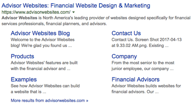
“Advisor Websites is North America’s leading provider of websites designed specifically for financial services professionals, financial planners, and advisors.” is the meta tag for advisorwebsites.com.
10. Responsive Design
Responsive design “responds” to whatever device you’re operating on. This means that browsing a webpage on your computer looks different than when you’re on your phone. Flexible images, fluid grids, and site maps are adjusted to fit the dimensions of your device. Notice how the Advisor Websites homepage adjusts from a desktop computer to a mobile device? PS. did you know that all of our websites are responsive? Check them out here.
11. Search Engine Optimization
Search Engine Optimization (SEO) uses various methods to improve the ranking of a website in search engines. The most effective way to do this is to optimize your website with keywords used by your prospective customers. These keywords should be incorporated into your content, page titles, links and more.
12. Whitespace
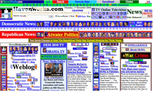
Whitespace is the space between images or texts. This is highly appealing to the eye and helps ensure that you don’t overwhelm the reader.
Here is an example of not enough whitespace:
And here is an example of whitespace used correctly:

Glossary of Terms
A basic dictionary of the most used web design terms:
- 301 Redirect
- Above the Fold
- ALT Attribute
- Call to Action
- Cookies
- Colour Scheme
- Conversion
- GIF
- Meta Tag
- Responsive Design
- Search Engine Optimization
- Whitespace
Before you go, make sure you download our Financial Web Design Guide below! You'll find a ton of tips and tricks to help you out there in the online world!


