Your website is more than just your digital business card, it's the focal point of your marketing strategy.
Research has shown that 94% of first impressions relate to your website’s design and you only have 7 seconds to communicate to visitors that you’re the best advisor for their needs.
This means that a poorly designed website experience has the ability to make or break your lead generation efforts, at the first impression or experience you deliver.
So how do you optimize your website for lead generation?

You will need to make strategic improvements to your website to convert more prospect traffic into leads and clients.
However, one of the biggest mistakes MANY financial advisors make today is ignoring this important foundational work, leaving lost business opportunities on the table.
Without a strategic website presence, you risk visitors abandoning your site for your competition.
In fact, 89% of consumers will shop a competitor after a poor online user experience - so if your website’s not up-to-date, engaging, or personalized, you’re essentially handing them to your competition on a silver platter.
A Look At Today's Landscape
It’s no secret that the worldwide pandemic had major impacts on the financial services sector, and countless others.
The adoption of technology – particularly digital – experienced massive acceleration.
As we watched the markets fluctuate rapidly at the beginning of the pandemic, and with the recent turmoil of the bear market, consumers are turning online more than ever before in search of financial guidance with new purpose and an extreme sense of urgency.
In fact, 81% of consumers do their own research online before choosing a financial advisor.
With this critical shift, tens of thousands of financial advisors have frantically worked to strengthen their online presence, which has brought new and more prevalent challenges to the competitive landscape.
If you feel like you’re the only advisor questioning how you can stand out online amongst the clutter and generate more leads, you are not alone.
So… how do you stand out online and generate more leads?

How Advisors Can Optimize Their Website For Lead Generation
You can start by developing a crystal clear understanding of your target audience, and then provide them with a personalized website experience.
In today’s increasingly competitive marketplace, delivering personalized and relevant online experiences is necessary to attract the right prospects, capture their attention, hold it, and convert them into leads and clients.
If your website presence isn’t personalized to speak directly to their needs, they’ll easily find another one who does.
1. Identify and Document Your Target Audience
One of the most important things you can do right now is to define and document your target audience appropriately, otherwise, how do you know how to tailor content to speak to their needs?
A great first step here is to review the attributes of your current clients.
There are various methods to collect this information, such as 1:1 interviews, customer surveys, connecting with your team on feedback, and reviewing customer data already stored in your CRM (or elsewhere).
Some data points to look for include:
- The demographics of your current clients.
- This can include age, gender, location, income, investment portfolio size and occupation.
- The psychographic attributes of your current clients, including:
- Interests, opinions, behaviours, and lifestyle choices.
- What do they care about?
- What motivates and inspires them?
- What problems are they trying to solve?
- What are their goals?
- What are their pain points?
- What are the challenges they face?
- Consider understanding why they chose you as their advisor.
- Was it your experience?
- Qualifications?
- Your fees?
- Reviews/referrals from other clients?

Identifying these will bring you one step closer to developing a deeper understanding of your target audience and increasing your chances of making meaningful connections.
If you don’t have a lot of data on your existing clients, or you’re just starting out, take advantage of feedback forms and surveys.
Use your site’s intake forms, social media, and other communities online to be a part of the conversation and collect this information and store it for future use.
Once you have this data, document it, analyze it, and share it with your team - so that everyone is on the same page about your ideal customer profile.
You can then use all of this important data to weave into your online presence through messaging and visuals.
We know that 74% of consumers are frustrated by website content that isn’t personalized…and website personalization can take many shapes and forms.
2. Personalize Your Website for Your Target Audience
There are many ways to personalize your website for the needs, desires, and interests of your target audience.
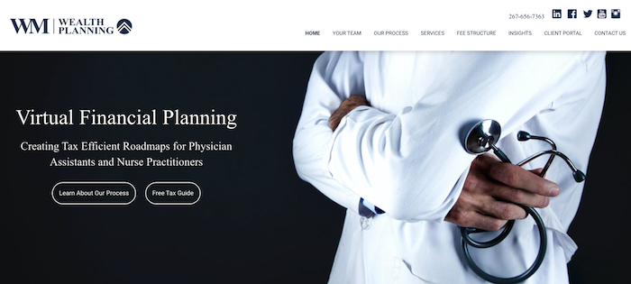
You can begin by tailoring images across your site to resonate with your ideal client.
For example, are you targeting members of the LGBTQ community?
Maybe you work with doctors and dentists?
Perhaps you specialize in working with retirees?
Emulate this in your online visuals.
You’ll also want to speak to this audience in your headline and in your copy across the site.
You want your target audience to feel reassured that they’ve landed in the right place, that your services are for them, and that you understand their needs and pain points.
This builds trust and makes your website more ‘sticky’, keeping visitors there longer, and lessening the odds that they’ll hop over to another site.

3. Humanize Your Brand
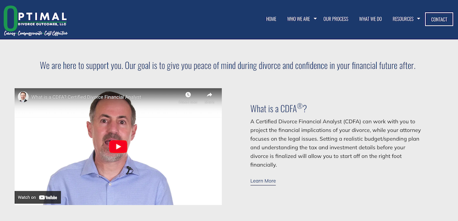
Personalizing your website doesn’t stop with tailoring it for your target audience, it’s also important that you show your audience who you are.
Studies have shown that consumers want to work with businesses that they can relate to, respect, and like - especially when it concerns their hard-earned dollars.
How can you leverage this?
Start by updating your ‘About Us’ page, which is the second most trafficked page on most of our advisors’ websites.
Prospects want to know who you are, so don't shy away from including some personal information about yourself such as your interests and hobbies.
Do you value family?
What do you like to do in your downtime?
This information might not seem relevant, but it makes you more relatable, trustworthy, and likable, which has a direct correlation to building trust and driving new business.
It’s simple, nobody wants to do business with someone they don’t like.
Include a quick video saying hello and welcoming visitors to your website so they can hear your voice and see what you look like or where you work.
You can further humanize your brand by showcasing members of your team and highlighting their accomplishments and personas.
This all feeds into standing out online and ensuring your prospects feel safe choosing you.
4. Use Social Proof
The SEC’s “modernized” marketing rule from December 2020 gave RIAs the ability to use client testimonials in marketing.
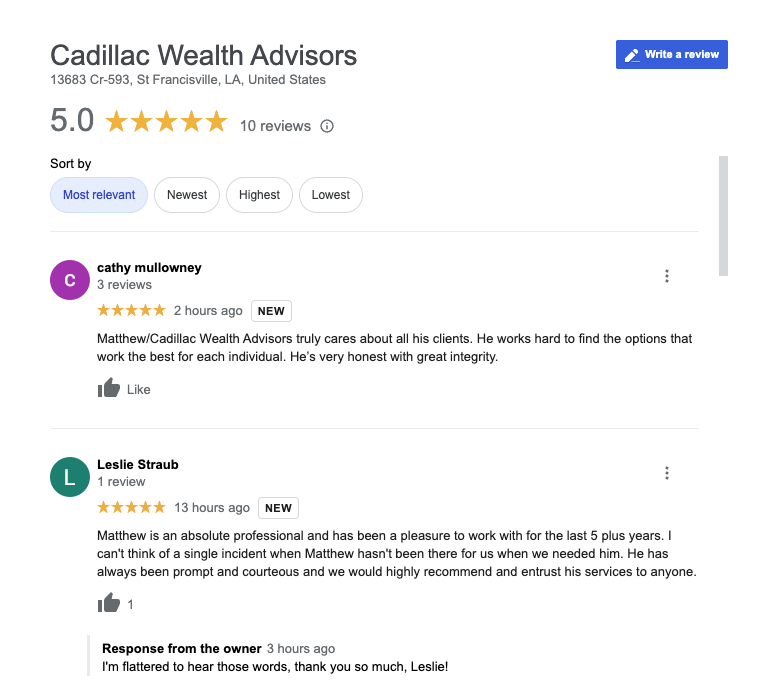
One of the best ways to sell yourself and build trust is by showcasing testimonials from happy clients that are similar to your target audience and who have faced the same problems that your firm solves.
According to Financial Planning Mag, less than 10% of RIAs today are taking advantage of that SEC ruling, which means publishing social proof will likely get you one more step ahead of your competition and really sell your audience on why you’re the right advisor for them!
5. User Experience (UX) Matters
Responsiveness
Does your website display well across various devices?
According to Stat-ista, mobile devices generated 59% of the world’s website traffic this year!
If your website doesn’t display well on mobile devices, you could be missing out on capturing leads.
No one is going to want to contact you if they can’t navigate through the content of your website with ease.
Your credibility drops tenfold as soon as your visitors have a poor website experience.
Site Navigation
The key here is simplicity and the hierarchy of information.
Ensure the most relevant pages of your site are available in the main navigation menu, with your contact information clearly displayed.
You don’t have to include links to every page of your site in the top navigation bar. You can leverage your footer menu if you want to link to additional pages.
Concise Copy
The rule of thumb here is that the most important information you want to share should be above the ‘fold’, a term born from newsletter publications.
The most relevant information should be front and center on your website, without requiring your audience to scroll down to see it.
Examples of items that should live above the fold are your logo, business name, value proposition, unique selling points, contact information, and call-to-actions.
A great guide for copy length on your website is less is more.
You want the copy to be concise, to the point, and skimmable. Remember, you only have 7 seconds to make a great first impression and tell visitors you're the advisor for the job.
6. CTA’s Play A Part
CTAs (call-to-actions) are likely one of the biggest lead drivers on your website.
Prominent call-to-action messages across your site are a great way to guide visitors to take the action that’s right for your business.
However, it’s first important to understand your goals.
Do you want to build your email list?
Do you want them to connect with you for a consultation?
Whatever your objectives are, ensure you have CTA’s sprinkled across your website to drive the right behaviour from your audience and capture those leads.
If your CTAs are hidden or not prominently displayed, how are prospects going to easily get in touch with you?
You can ensure that your CTAs stand out from the rest of the content on your pages by designing them as a button in a different colour, increasing the font size, or outlining them in a box that grabs their attention.
7. Don’t Forget About These Lead Capture Methods
Finally, ensure your website is set up with ways to capture leads such as:
- Contact forms
- Digital calendar
- Email sign up
You want these methods to be displayed prominently on your website to capture those leads when they're hot and ready to connect.
Be intentional with the information you collect as it can add to insights on your target audience, while also considering the rule of thumb from earlier, that less is more.
Studies have shown that conversion rates on forms are much higher when you ask 5 questions or less.
Anything more becomes a roadblock to visitors that could affect the number of people completing forms on your site.
You want to make sure your forms are as easy as possible to complete with the least amount of friction.
Key Takeaways
To summarize how to convert your website into a lead generation machine, you should:
- Identify and document your target audience.
- Personalize your website for your target audience.
- Use humanization and social proof to build trust.
- Offer a positive user experience with a responsive website design.
- Use simplified site navigation, concise copy, and messaging.
- Leverage powerful CTAs with lead capture measures in place.


