These 3 Website Mistakes Could Be Costing You Clients
Introduction
It’s no secret that having a strong online presence is a must in today’s changing world. Your website functions as your virtual business front, lead generation tool, client communication, and is the center of your online presence. A website that’s executed correctly can make all the difference in your business success. However, one of the largest misconceptions is that ‘just having a website is enough’ when the reality is there are a lot of elements that go into making a functional and successful website for business growth.
Here are 3 common website mistakes that could be losing you clients:
Portraying Unprofessional Brand Image
We’re all familiar with the saying “never judge a book by its cover”, unfortunately, this cliche does not translate to web design. Prospects will make a snap judgment of your website, and therefore your brand within moments of landing on your homepage. More specifically, it takes about 50 milliseconds (that’s 0.05 seconds) for users to form an opinion about your website that determines whether they like your site or not, whether they’ll stay or leave.
Our advice is to make your website reflect your business as closely as possible. Add details that reflect your company values, industry niche, and the people behind your success (both staff and clients). If you’re stuck, take a look at others in your industry for inspiration. Even if you feel that your website is strong and represents your business well, this is a great practice to experience what your prospects do during their buyers’ journey. You’ll notice how quickly you also make a judgment on elements you may not have recognized on your own website. For example, how clear your CTA (Call to Action) buttons are, what menu items are included in your navigation bar, or the images within your hero banner. If you’re looking for inspiration, here’s a great place to start: Top Ten Best Financial Advisor Website Examples.
Ready to see how the Frameworks can be personalized?
|
Lacks Security (SSL Certificate)
Being in the Financial Services Industry, the last thing any prospect wants to see as their first impression of your business is a bright caution sign warning them that your website is not secured! Regardless if you’re asking for sensitive information on your website or not, security should not be in question when prospects visit your site.
In order for your website to be secured for yourself and your clients, it needs to have an SSL Certificate. If you’re not familiar with what an SSL Certificate is; it stands for Secure Sockets Layer, a feature that ensures the necessary level of security to protect both yourself and your clients’ data from information thief.
Without an SSL certificate here’s a preview of what your visitors will see:
|
How to identify if your website is secure If you’re not sure if your website already has its SSL Certificate, there is a straightforward to find out.
Here is how your URL will look with and without an SSL Certificate: → http://yoursite.com vs. https://yoursite.com |
For any business, having an unsecured website is a disaster for brand reputation, but it also absolutely affects your website’s ability to generate leads. Here are 2 other reasons why you need to consider getting SSL for your website if you don’t have it currently!
|
Request a complimentary Website Assessment. |
Doesn’t Work on All Devices (Not Mobile Responsive)
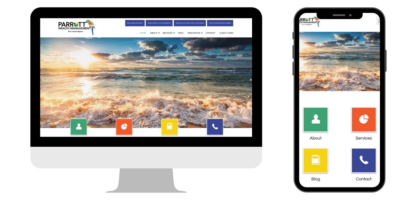
Last but certainly not least, is your website’s ability to adjust to screen size and device. After putting in the effort to create a beautiful and professional website, it would be a shame if the majority of your website visitors were not able to view it - simply because they were on their smartphone or tablet.

This is why you’ll want to make sure your website is optimized for all devices. A mobile responsive website automatically adjusts according to the screen size and orientation (landscape or portrait) of the device. We’re not exaggerating when it comes to the number of leads that can be lost to this detail; 57% of internet users say they won’t recommend a business with a poorly designed website on mobile.
Do you know the difference between 'mobile responsive' and ‘mobile friendly’? Learn the difference HERE.
Not sure if your website is mobile responsive? Try this test:Step 1: Open your website on your computer. Step 2: Drag the corner of the page to make the window smaller.
|
WHO ARE WE?
At Advisor Websites we help financial advisors grow their business and enhance their digital marketing strategies with their own personalized website. Our platform offers a selection of effective and proven frameworks that are personalized to reflect your business and brand.
To see our platform in action today:


