
Welcome to Part numero dos (Part 2) of "Design Strategies That Increase Conversion Rates"!
In Part 1, we delved into 4 critical design practices that can help give your conversion rates a major boost. We focused on being selective about how to showcase written text/copy, images and products/services on your website to really capture visitors that stay - elements that are often overlooked and taken-for-granted but make a huge difference in conversions when done right.

In this article, we will take a slightly different approach to discussing design strategies that attract loyal clients. We're going to talk barriers.
Lack of knowledge about your service, skepticism and painful sign up processes all pose as threats and barriers to conversions. It's important to knock these down in order to capture leads that stay, possibly forever. Here's how...
1.) Use Video To Showcase Your Service & Product
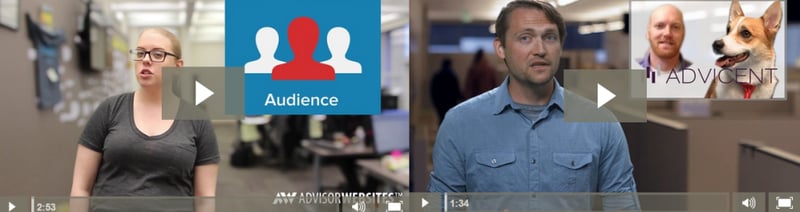
Videos are becoming a highly prevalent medium to showcase products as well as services. This is because a lot more can be shown and explained in a short amount of time than with images.
Videos allow viewers to better digest the content they receive as there is less effort to engage in the material. All you really have to do is to just sit back, watch and listen. Easy-peezy.
In short, if an image is worth a thousand words, then a video is worth a million.

A perfect way to use video to show off your service is to embed it in a prominent position on your website such as the homepage, right beneath your banner or even on a landing page.
2.) Social Proof
 Social Proof refers to a psychological phenomenon that occurs when people aren't too sure about the course of action they should take and in response to this skepticism, turn to others to follow what they do.
How many times have you looked up a restaurant review online before making a final decision on where to eat for dinner? You most likely check the comments made by reviewers, count the number of stars the restaurant is rated by, or even the number of reviews there are. Either way, we enjoy taking the time to hear others' opinions and what their likely course of actions are before performing them ourselves because it makes us feel safer and more reassured.
Social Proof is seen everywhere. It takes the form of reviews (as mentioned earlier), followers, likes as well as testimonials. In today's digital world, people are growing increasingly obsessed over the amount of social proof they receive because it can help boost conversions.

By utilizing the testimonials section of your dashboard, you're using social proof to your advantage because you're advertising that your services is popular and approved by others. It gives prospects a stronger urge to convert.
3.) Make It Easy to Sign Up
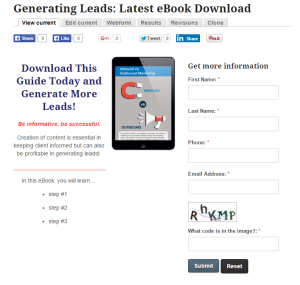
Nobody like sign up forms. They're barriers. As the last stage in your conversion funnel, sign up forms should always be made as easy to fill in as possible with little to no effort.
Here are a few tips and tricks to prevent losing that lead in the last stage of it all:
- Don't ask for optimal information (it can always be filled in later)
- Keep it short, not long
- Remove additional navigation and content elements from the sign-up page, leaving just the form visible (PSSST...see a tutorial on how to create a landing page here)
- Link the form back to the homepage after submission
The Key Take-Aways
To sell effectively involves selling solutions, not products or services. It's essential to sell benefits, not features.
The point is to cast a wide net in hopes of catching loyal customers, you must think in terms of the customers you are targeting; think about their wants and ways in helping them solve their problems. In doing so, you need to break down the barriers that customers put up when evaluating how valuable your service/product is to them.
In retrospect, here are the 3 design strategies to knock these annoying barriers down:
- Use video to showcase more of your product and services to better educate viewers about what your brand stands for
- Take advantage of testimonials to elicit social proof. People enjoy seeking confirmation that a service or product is indeed valuable before making a final decision.
- Keep all sign-up processes simple and pain free. This means making webforms short and concise.
And there you have it folks - an additional 3 design strategies to help boost your conversion rates.