We all know the benefits of websites for financial advisors; helps you build trust with potential clients, a way to capture new leads, gives you credibility, provides you with the opportunity to promote your services, and so on.
The harder step is choosing a website provider to build you a website that is functional, beautiful, and effective at capturing new leads.
|
To learn about what makes a website successful, check out our eBook: Website Best Practices for Financial Advisors |
To give you inspiration, in no particular order (apart from alphabetical), here are the top financial advisor websites of Summer 2020.
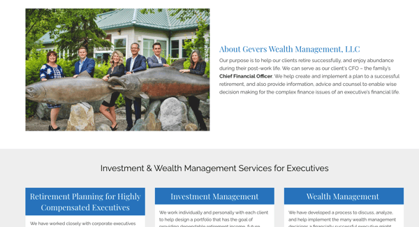
Gevers Wealth Management
Goal: Loved the Dawn website framework and wanted to be able to provide their own content and video.
Brief Overview: Gevers Wealth Management have a team member who is a videographer and was able to provide their own video. In addition, they loved the Dawn framework and knew it would work for their business. The Advisor Websites team were able to seamlessly bring their vision to life.
URL: https://www.geverswealth.com/
Framework: Dawn
Our favorite feature/s:
- Eye grabbing video banner.
- Love the abundance of bite-sized pieces of information on the home page.
- Great navigation with easy-to-use menu and well placed CTAs.


Pulse Financial Group
Goal: Wanted a simple website that isn’t inundated with too much content or information.
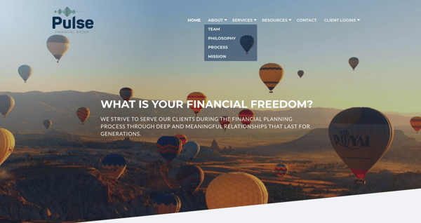
Brief Overview: Pulse Financial Group knew they wanted a clean and simple website to provide a seamless user experience. With such clear goals in mind, the designers at Advisor Websites were able to build exactly what Pulse Financial Group were after.
URL: https://pulsefinancialgroup.com/
Framework: Linebreak
Our favorite features:
- Excellent menu bar with sub-menu items, providing the user with easy navigation.
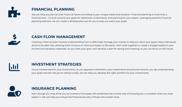
- Easy to read ‘Personal Planning’ and ‘Business Planning’ pages detailing their services.
- Great use of CTAs on the home page.
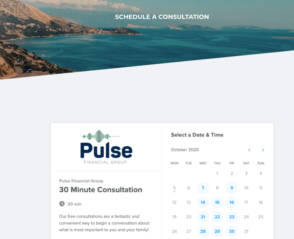
- Calendar integration to schedule an appointment.

Stark Capital Management
Goal: Wanted a website that was information-focused, without a lot of filler.
Brief Overview: Stark Capital Management’s website is mostly a one-page scroll design. In addition to the main page, it also has additional pages such as a blog, financial calculators, useful links and contact us. The great variety of pages (without being too many pages) strengthens the effectiveness of the site as information is readily available to website visitors.
URL: https://www.starkcapitalmanagement.com/
Framework: Dawn
Our favorite features:
- Eye grabbing video banner.
- The website is ‘clean’, providing beautiful visual aesthetics.
- The site is nice and simple to use and navigate, providing an excellent user experience.


WHA Financial Advisors
Goal: Wanted a high impact website with lots of CTAs to capture leads.
Brief Overview: WHA Financial Advisors have a logo with four different (and complementary) colours, and the website uses the brand colours seamlessly.
URL: https://www.whafinancialadvisors.com/
Framework: Jericho
Our favorite feature/s:
- Lots of CTAs on the home page, helping clients click to where they want to go.
- Easy to understand ‘Our Services’ landing page, where you can click into a particular service for more information.
- Great resources with blog, financial calculators and useful links.



| You might also be interested in seeing the Top 10 Best Financial Advisor Website Examples: 2019 Edition |
The above websites all have something in common; they provide a good user experience with easy navigation and lots of clickable links. They are also visually appealing which is a key component in an effective website.
Whatever the goal of your website, there is a design framework available that can be personalized to your individual business needs. Our team of specialists also work one-on-one to ensure your website meets your goals, and they provide useful tips so you get the most out of your site.
You might also be interested in finding out 3 Website Mistakes that Could be Costing You Clients.
WHO ARE WE?
At Advisor Websites we help financial advisors grow their business and enhance their digital marketing strategies with their own personalized website. Our platform offers a selection of effective and proven frameworks that are personalized to reflect your business and brand.
To see our platform in action today:


